By [TrickDigi]
If you own a retail store, you know the most painful sound in the world.
It is the silence of a customer walking out the door empty-handed.
Last year, my small shop was struggling with a specific metric: Average Order Value (AOV). We had plenty of foot traffic. People were buying the “Core Item” they came in for (let’s say, a $40 shirt), but that was it. They bought the item and left.
My margins were getting squeezed by rising rent, and I needed to squeeze more revenue out of every single person who walked through the door.
I couldn’t afford a marketing agency, so I decided to run a physical experiment. I spent a weekend with a screwdriver and a sore back, completely rearranging my store’s “Hot Zones.”
The goal? To master the psychology of the “Impulse Buy.”
Here is exactly what I changed, why I did it, and the data on how it impacted my bottom line.
The Mistake: The “Library” Layout
Originally, my store was designed to be “clean.”
-
The checkout counter was hidden in the back corner (to encourage people to walk through the store).
-
The counter itself was empty, except for a POS screen and a business card holder.
-
The lighting was even and flat.
I realized this was a mistake. I had created a “Library.” It was peaceful, but it wasn’t profitable. By hiding the checkout, I was making it hard for people to give me money. By keeping the counter clean, I was missing the last chance to sell.
The Change: The “Gauntlet” Strategy
I decided to redesign the queue experience. In retail psychology, the customer is most vulnerable to “Decision Fatigue” when they are standing in line. Their brain is tired of making big decisions, so they crave small, easy rewards.
I made three specific changes:
1. The “Snake” Queue
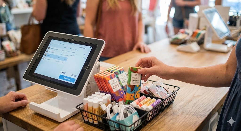
Instead of an open space leading to the register, I used shelving units to create a narrow path (a “snake”) that forced customers to walk past small, low-cost items while waiting.
2. The $10 Rule
I realized that for an item to be an “Impulse Buy,” it needs to require zero thought.
-
Old Strategy: I had $30 items near the register. Too expensive.
-
New Strategy: Nothing near the register costs more than $10. I stocked lip balms, fun socks, stickers, and travel-sized gadgets.
3. “Eye Level is Buy Level”
I moved the high-margin items (like branded accessories) from the bottom shelf to exactly 5 feet off the ground.
The Data: Month 1 vs. Month 2
I let this new layout run for 30 days. I pulled the reports from my POS (Point of Sale) system to compare the data against the previous month.
The results were not subtle.
| Metric | Month A (The “Clean” Layout) | Month B (The “Impulse” Layout) | Change |
| Transactions | 450 | 465 | +3% (Negligible) |
| Units Per Transaction (UPT) | 1.1 | 1.6 | +45% |
| Average Order Value (AOV) | $42.00 | $48.30 | +15% |
| Total Revenue | $18,900 | $22,459 | +$3,559 |
The Insight: Notice that my traffic didn’t really change (450 vs 465). I didn’t get more customers. I just got the same customers to spend $6.30 more per visit.
That extra $6.30 was pure profit because it came from small accessories with 70% profit margins.
The Psychology: Why It Worked
After watching my customers for a month, I realized why the new layout worked.
1. The “Decompression Zone”
I learned that customers instinctively turn right when they enter a store. I originally had my counter on the right. This blocked them.
I moved the counter to the left side (the exit path). This freed up the right side—the “Power Wall”—for my most expensive, attractive merchandise.
2. The Dopamine Hit
When a customer grabs a $5 item from a bin near the register, they aren’t buying a product; they are buying a dopamine hit. It feels like a “treat.”
By placing colorful, tactile items within arm’s reach while they waited, I triggered that reward system.
3. Removing Friction
In the old layout, customers had to ask, “Do you have batteries?”
In the new layout, the batteries were staring them in the face.
If a customer has to ask a question to buy an item, you have already lost 50% of the sales.
Conclusion: Clutter is Cash
I admit, I miss the look of my clean, minimalist counter. It looked like an architectural magazine.
But I don’t run a magazine; I run a business.
The new layout looks a bit more cluttered. There are baskets of goods everywhere. But that “clutter” is generating an extra $3,500 a month in revenue which pays my utility bills and part of my rent.
If you have a retail store, stop trying to make it look like an art gallery. Walk your own store as a customer. If you can walk from the entrance to the register without being tempted to pick up something small, you are leaving money on the table.
-
Disclaimer: I am not a professional retail consultant. These results are specific to my store’s location and inventory. Retail results may vary based on your specific industry and customer base.